Data visualization is the graphical representation of data and information through visual elements such as charts, graphs, maps, and diagrams. It involves transforming raw data into visual formats that are easier to understand and interpret.
Data visualization allows individuals to perceive patterns, trends, and relationships within the data, enabling them to gain insights, make informed decisions, and communicate findings effectively.
Why is Data visualization important?
Data visualization is important for several reasons:
Uncovering Insights and Patterns: Visualization facilitates the discovery of relationships and correlations within datasets. By representing data visually, analysts can identify trends, anomalies, and patterns that may go unnoticed in tabular or textual forms. These insights can lead to valuable discoveries and inform decision-making processes.
Supporting Decision Making: Data visualization helps decision-makers to make informed choices based on a clear understanding of the data. By visualizing different scenarios, trends, and comparisons, decision-makers can evaluate options, identify risks, and assess potential outcomes leading to more effective decision-making.
Detecting Errors and Outliers: Visualization can help identify data quality issues, errors, and outliers more efficiently. Visual representations make it easier to spot inconsistencies, gaps, or irregularities within datasets, enabling data analysts to investigate and rectify potential problems.
Communicating Information Effectively: Visualizations are powerful tools for conveying information and insights in a concise and understandable manner. They enable individuals to present complex concepts and data-driven narratives to technical and non-technical audiences.
Numerous languages support and have packages for data visualization. In this article, we will be using the Julia programming language. One of the known applications of Julia is Data Science and Visualization and we will be using the package, Plots.jl.
Getting started with Plots.jl
Plots.jl is a popular and powerful Julia package for data visualization. It provides a high-level interface for creating a wide range of plots, including line plots, scatter plots, bar plots, histograms, heat maps, and more. In this section, we will look at setting up Plots.jl.
Installing Plots.jl
To begin with IJulia, the Julia Language has to be first downloaded. If Julia is already installed, this part can be skipped. After installing Julia, head over to the Julia REPL and type in the following
julia> using Pkg
julia> Pkg.add("Plots")
or enter the pkg mode by typing in ] in your terminal and then
(@v1.8) pkg> add Plots
Note: To exit the package terminal, simply hit the backspace button.
Basic plotting syntax and data structures in Plots.jl
In Plots.jl, the basic plotting syntax involves creating a plot object and adding data and plot attributes to it. Here's an overview of the basic plotting syntax and common data structures used in Plots.jl
Creating a Plot Object:
 using Plots
 plot()  # Create an empty plot object
Adding Data to the Plot: Plots.jl supports basic data structures such as arrays and vectors.
 x = [1, 2, 3, 4, 5]
 y = [2, 4, 6, 8, 10]
 plot(x, y)  # Add line plot with x and y values
Customizing Plot Attributes: Plots.jl provides a concise syntax to customize plot attributes directly within the plot function.
plot(x, y, title = "My Plot", xlabel = "X-axis", ylabel = "Y-axis", legend = :topright, line = (:dot, 2), marker = (:circle, 8))Displaying the Plot:
plot!(x, y) # Use plot!() to add additional data to an existing plot
The visual representation of the code above is:
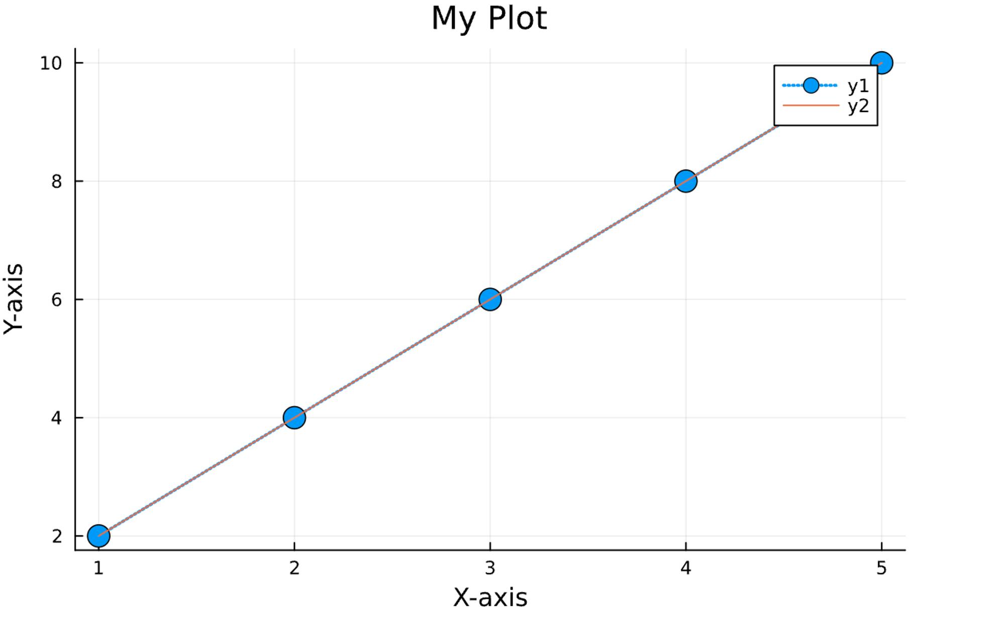
Plots.jl offers many more customization options and features, including different plot types, annotations, legends, subplots, and interactive elements. The above examples demonstrate the basic syntax and data structures to create and customize plots using Plots.jl.
Exploring Different Plot Types
Plots.jl offers a wide range of plot types to visualize different types of data. In this section, we will explore the various plot types using the base x and y values:
x = [1, 2, 3, 4, 5]
y = [2, 4, 6, 8, 10]
Line Plot
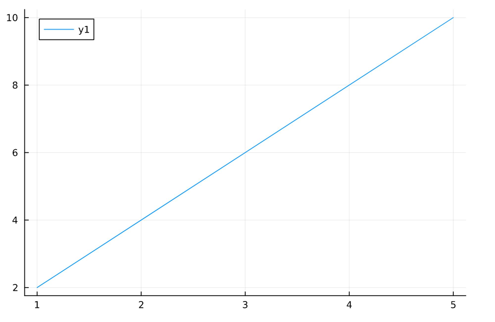
To create a line plot in Plots.jl, the plot() function is used.
plot(x, y) # Basic line plot
Which would give:
Scatter Plot
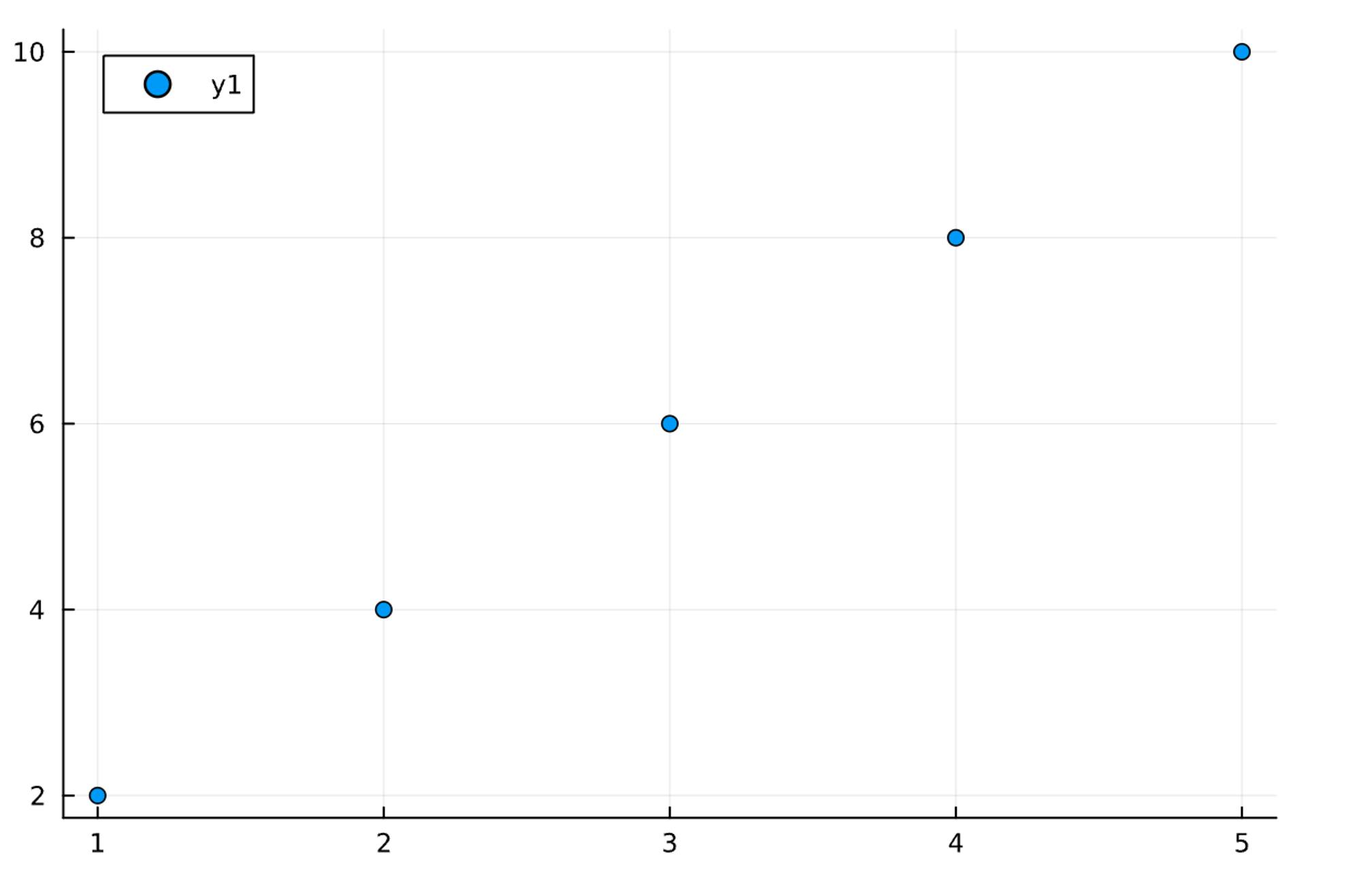
The scatter() function is used to create a scatter plot in Plots.jl
scatter(x, y) # Basic scatter plot
Which would give:
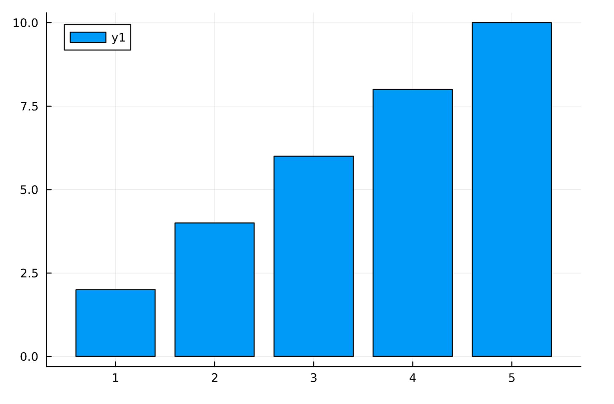
Bar Plot
The bar() function is used to create a bar plot.
bar(x, y) # Basic bar plot
Which would give:
Advanced Plot Customization
Advanced Plot Customization in Plots.jl allows us to tailor our plots to meet specific needs and enhance their visual appearance. Here are some techniques for advanced plot customization in Plots.jl:
Adding Labels, Titles, and Annotations.
Working with Legends and Color Palettes.
Controlling Axes and Grid Lines.
Customizing Line Styles and Markers.
Sharing and Exporting Plots
In Plots.jl, there are several options for sharing and exporting your plots. Some common methods to share and export plots are created using Plots.jl is:
- Saving Plots to Image Files: Plots.jl allows you to save your plots as image files in various formats, such as PNG, JPG, SVG, or PDF. You can use the
savefig()function to save the plot to a file.
using Plots
plot(x, y)
savefig("plot.png")  # Save the plot as a PNG file
- Exporting Plots as Vector Graphics: Plots.jl supports exporting plots as vector graphics, such as SVG (Scalable Vector Graphics) and PDF (Portable Document Format). Vector graphics retain the scalability and resolution of the plot when zoomed or resized.
using Plots
plot(x, y)
savefig("plot.svg")  # Export the plot as an SVG file
savefig("plot.pdf")  # Export the plot as a PDF file
Conclusion
We can establish that data visualization is a fundamental tool for exploring, analyzing, and communicating data effectively. It brings data to life, enabling us to understand complex information, make informed decisions, and drive impactful change.
Also, it is possible to perform data visualization with Julia as it has various packages available. Plots.jl offers a wide range of plot types, from the basic line and scatter plots to more advanced visualizations such as heatmaps, violin plots, and 3D plots.
By leveraging the capabilities of Plots.jl, we can unlock the potential of data visualization to gain insights, communicate findings, and make informed decisions.
